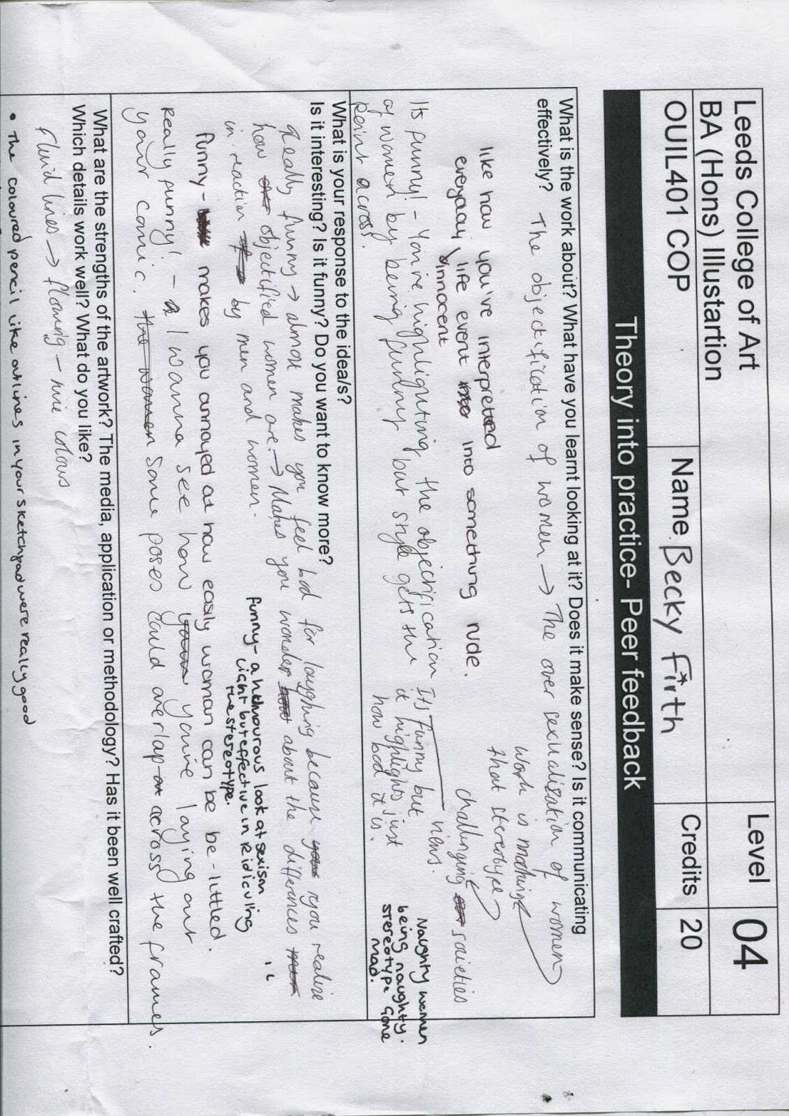
After deciding that I wanted to make a comic, I needed to develop a character that would be easy enough to draw many different times but would also be able to manipulate into scenarios where it would immediately communicate the overly sexualised message behind the narrative. I decided that I wanted to carry on using pencils are they are easy to create detail with, yet can create a nice blended and subtle colour, as I wanted to use a kind of monochrome palette of reds and pinks, I needed something that could create a wide tonal variety of the same colour in order to create depth in the work.


After I got a bit bored of experimenting with coloured pencils I decided I wanted to try something a bit different and more bold, as I had considered using Risograph printing to execute the final piece, so it would have been hard to seperate the colours had I used coloured pencils. I really liked the way this looked and it is something I intend to carry on experimenting with because I think the block colour is a nice contrast between the sktechy lines of the ink, however I don't think it fully suited this project, as it was much easier to create a full image using the softer pencils.


I think this image worked especially well because of the curved lines I used to create her body shape, although this is not exactly how a person would look, I think the fluid lines create a visually pleasing aesthetic that creates movement in the work and makes the character seem more realistic.


.jpg)


These were the images that made me realise I would not be able to use this technique of ink and pen, because when doing a larger image rather than just a figure, it was not as visually pleasing, because it was very hard to get different tone and depth and create shadows, which made it look very messy when trying to do this with pen and texture.


No comments:
Post a Comment