Tuesday, 10 March 2015
OUIL501 - Vintage Ladybird Books
I have a small collection of vintage illustrated children's books, which I looked at for reference when thinking about how I should approach my book. The narrative of the Snakes book was exactly how I wanted mine to be, blunt and straight to the point, as I think, reading this as an adult, already has an element of humour to it.
Most of the books had a similar style of illustration, using quite realistic looking drawings with a simple and realistic colour scheme, mainly because they are instructional books, however the Bedtime Rhymes book was quite different, the style was much brighter and more vivid colours and the drawing technique was much less true to life, focusing more on using block shapes and colours.
Friday, 6 March 2015
OUIL501 - Vintage Ladybird Books


One thing that inspired me when thinking about the aesthetic of my children's book was vintage Ladybird books, especially the colours that are used, they always seem quite faded and neutral. I want to mix this with my style of creating texture and bold image.
The narrative style of Ladybird books is also something that I want to try and include in my own book, in the instructional books particularly, the narrative style is quite blunt and straight to the point, obviously to make it easy for children to understand. I think using this style of writing will help to give the appearance of a children's book yet adding adult humour will mock the context.
Wednesday, 4 March 2015
OUIL501 - Vintage children's book illustration


I found these illustrations on Pinterest, they are Polish vintage children's book illustration, and because I don't speak Polish, I found it hard to find out who the artist was. But I was really inspired by these, mainly because of the colours, they're bright and muted at the same time, and the colour palette is really simple. Each page is mainly blue and black with one pop of colour to create a focal point, which I think creates a really pretty and quite relaxing image.
Tuesday, 3 March 2015
OUIL501 - Olga Demidova


I found Olga Demidova's work on Ohh Deer's Facebook page and fell in love with it instantly. The colours and textures in her work definitely influenced how I decided to go ahead with completing my work. In the first image especially I think that everything works together to create a lovely looking image, the foreground frames the rest of the scene well and the colours all compliment each other well to create a warm and inviting aesthetic that works perfectly for children's book illustration. I will definitely be keeping my eye on her work for future inspiration.
Monday, 2 March 2015
OUIL501 - Laurent Moreau
After doing some research I found the work of Laurent Moreau. His style of work is exactly what I want to try and incorporate and mix with my own style of working for my children's book.


I think that using bold, block shapes with one tone of colour, then using marks to create texture, will work best for the context of this brief, as it fits the style I want to convey, it looks kind of like collage but using paint. Using this sort of childish way of working is a good juxtaposition to the content of my book, which will be quite gruesome while explaining the slaughter process of farm animals.
OUIL501 - Children's book illustration
Follow Becky's board Childrens book illustration on Pinterest.
I have decided, that to add more context to my practical work, I will make a mock children's book, I have looked at work on Pinterest to get inspiration for the aesthetic of my work. I will create a story around the slaughter process of cows. At first I was going to create 3 seperate books looking at different farm animals but realised this would be way too much work for the time I had left. Even though colours on farms aren't bright or varied, I want my work to have a bright colour palette in order to communicate the aesthetic of other children's books. I thought that the juxtaposition between the imagery of childrens book illustration and the gory subject of animal slaughter would be a good way to create something quite comical.
I have decided, that to add more context to my practical work, I will make a mock children's book, I have looked at work on Pinterest to get inspiration for the aesthetic of my work. I will create a story around the slaughter process of cows. At first I was going to create 3 seperate books looking at different farm animals but realised this would be way too much work for the time I had left. Even though colours on farms aren't bright or varied, I want my work to have a bright colour palette in order to communicate the aesthetic of other children's books. I thought that the juxtaposition between the imagery of childrens book illustration and the gory subject of animal slaughter would be a good way to create something quite comical.
OUIL501 - First hand research imagery
To get some reference imagery for my children's book I went to a nearby farm and took some pictures of the animals. I mainly wanted to get a feel for the colours and textures that you see on a farm so that I could recreate these in my work.
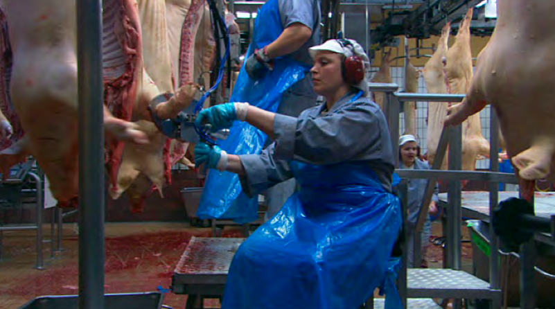
OUIL501 - Our Daily Bread - Nikolaus Geyrhalter
I watched Nikolaus Geyrhalter's documentary 'Our Daily Bread' which shows how modern food production companies use technology to maximise efficiency, profit and consumer safety. The documentary doesn't contain any voice overs or interviews as the director wanted the viewers to be able to form their own opinions. The goal of the documentary was to provide a realistic view of modern food production companies.


Sunday, 1 March 2015
OUIL501 - Practical Feedback tutorial
After speaking to Eleanor about the practical side of my project I have decided to take my work in a different direction. Instead of creating a layered drawing I have decided I want to create a mock children's book, that will look at the slaughter process.
I think that the context of a children's book is much more powerful as a piece of work, because it represents the naivety of the general public regarding the meat industry and the slaughter process. I think the light hearted look of a children's book will contrast well with the shocking imagery of slaughter.
I don't think that the book would be specifically targeted at children, because of the narrative, I want it to be targeted more at an adult audience because it is mocking the naive nature of children's books and their blunt nature when explaining processes.
Subscribe to:
Comments (Atom)