Saturday, 26 October 2013

OUIL401 - Study Task 3


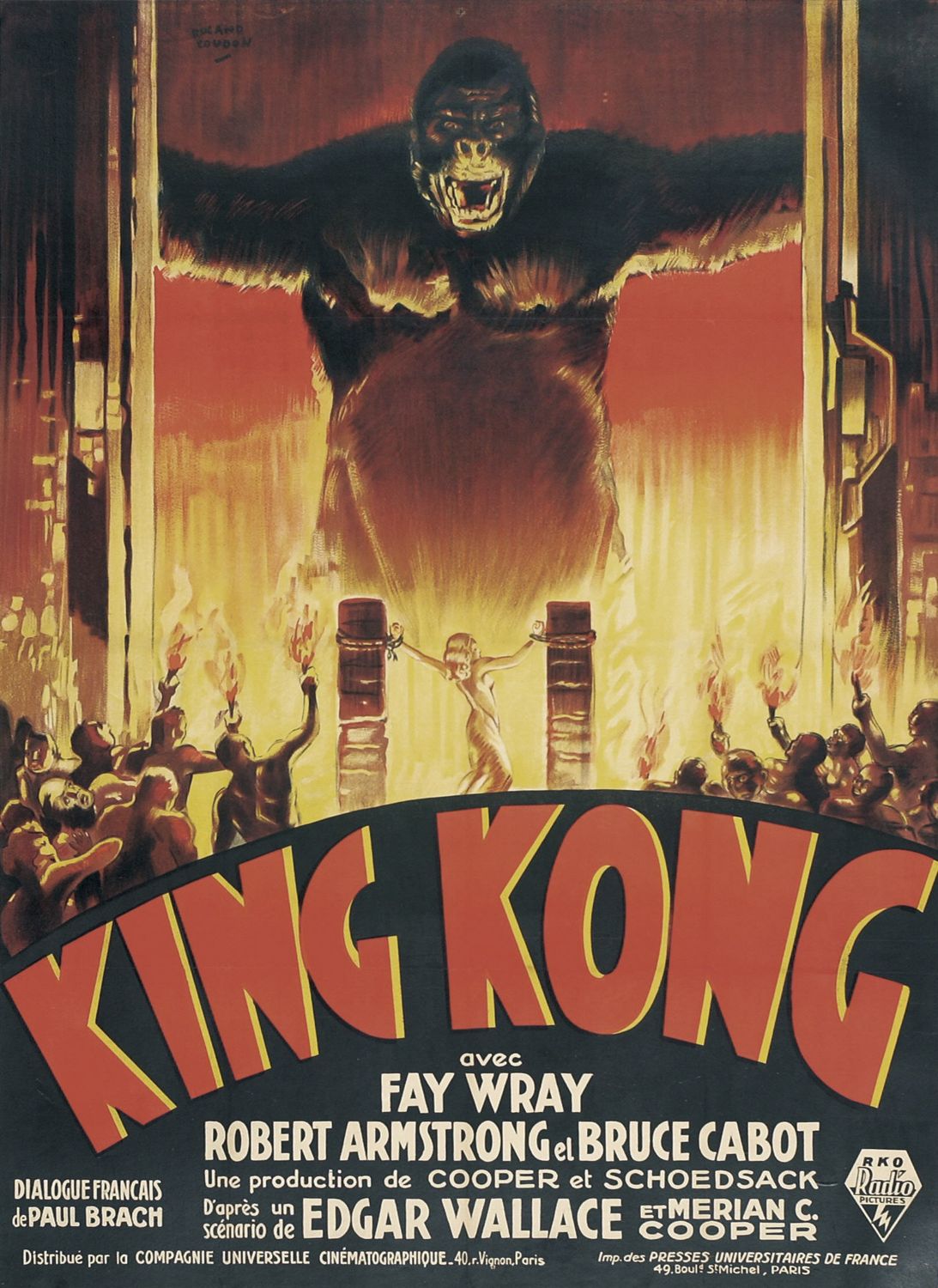
Poster for King Kong, the 1933 film.

Both the movie King Kong itself, and the poster for it has a lot of symbolism within. Firstly, the story behind King Kong is of an ape who is forcibly taken from his home island, and put on display as an attraction in the US, however he breaks free and goes on a rampage throughout the city, taking a woman as hostage. This parallels quite clearly to the shipping of black slaves to America. King Kong, who is the focal point in the centre of the image denotes what everyone recognizes as an ape and the connotations are something that is wild and powerful, something that should be feared. This links to the fears that many people held about the black slaves that were brought over, that they would rise up and fight back against the native people, taking the white American women and challenging the societys idea of completely "American" culture The image of King Kong represents the attitudes that people of 1930s American people had towards blacks, that they were something that existed for entertainment purposes, to be ridiculed and laughed at but should also be feared. The image of an ape may also have connotations of an animalistic sexual desire, we see that King Kong is staring directly at the female character, who is also central in the image, this again represents the fear that the slaves would try and "take" their women and violate them. The female in the image, is shown to be wearing white which connotates vulnerability and pureness, which contrasts to the dark and menacing image of King Kong, who is highlighted with the red of the fire, signifying evil and danger. The fact that the woman is chained could have connotations of women's suppressed sexuality at that time, which King Kong is about to break when he takes her away, this again could symbolise the fear that blacks would encourage sexual promiscuity in women and corrupt their pure and virginal ways. The crowds of people holding burning torches, at the bottom of the page, could have connotations of linking to the KKK, the men in the crowds would have been white because of the context of the poster and the time it was produced, and the way they are shown holding the torches being aggresive towards King Kong, is similar to images of crowds of KKK members. At the time this poster was produced (1933) the numbers of KKK members had began rising since the mid 1920s and society was scared of blacks alienating their culture, so the imagery shown in the poster would have appealed to the average american, appealing to their patriotic side and their fears. The text at the bottom of the image is very bold and captures the attention of the viewer, it reflects the colour palette of the rest of the image, the colours are very bright towards the centre of the image where the woman is chained, and get darker as the go upwards towards King Kong, these colours symbolise the connotations that the poster is trying to put across through the imagery of the woman and King Kong.


Saturday, 12 October 2013

OUIL401 - Study Task 2

Even though both images are very different styles, when compared they do share some aspects of purpose and meaning. The main purpose of both images is to "recruit" people into the ideologies the posters are trying to communicate. The poster by Savile Lumley tries to play on the conscious of the viewer, into joining in the 1st World War. The male figure who is the main focal point in the poster, is staring straight at the viewer. The italic font at the bottom reinforces the message, and plays on the stereotypical males role, to be a man, you must join the war and if you don't, you will have failed as a man. The Uncle Sam Range advertisement relies heavily on playing on America's patriotism to interest people in the product.The fact that Uncle Sam is the central focal point, and is shown to be feeding the world, tries to show off Americas wealth, playing on peoples beliefs that the US is better than anywhere else in the world. The advert was produced in 1876, 100 years after America's independence, so using lots of patriotic imagery will and presenting the American ideal will make people believe that by buying this product, they too will be as great as America, and if you want to be a good American, you must buy this cooker.

There is a lot of patriotic imagery in both images, the Uncle Sam advert is practically made up of patriotic colours and symbolism, from the way that Uncle Sam is the main focus to how the list the globe is holding makes a mockery out of other countries through racial stereotyping, enforcing the "America is great" ideology. The other image, using iconography typically associated with British culture, such as the Beef-eaters that the child is playing with and the roses on the curtains, again reinforces the idea of being proud of and supporting a culture through participating in the event/product the advertisements are promoting.

Both images try to target a primarily male audience, both playing on the stereotype of strong male figure, who provides for his family. The Savile Lumley uses the imagery of the children and the text at the bottom to make the male viewer feel guilty for not being part of the war, and doing "his duty" as a man. The text is trying to make the viewer think and question him role as a male and father, if he didn't join the war. The simple style of the illustration is straight forward and puts the point across easily without any added fuss, however the other packs as much imagery in as possible in order to put the point across and reel in the viewer. The Uncle Sam targets the male and promotes the cooker to him, not by focusing on the different aspects of the cooker itself, like it would if it was targeting females, but rather focuses on what can be gained from buying the cooker, it focuses on aspects that males would aspire to achieve, like wealth and power and the typical American ideals.

Tuesday, 8 October 2013

OUIL401 - Study Task 1

1- Zdzislaw Beksinski


Zdzislaw Beksinksi's work is where I draw a lot of inspiration from for my work, not only do I love his very intricate way of working but also the scenes he depicts. The figures that he paints are a weird mix of realistic yet exaggerated, they appear anatomically correct yet certain parts like joints and length are are emphasized. This is something I would like to try and weave into my work, I like the look of thin, bony elongated figures which evoke an uneasy and mysterious feel, they look almost like something out of a nightmare. I think its quite effective the way that Zdzislaw does not try to explain any of his work, which I think allows for people to draw different things from each image, interpreting it how they like. As the images are so weird and complicated, I think its easy for people to see something different each time they look at it, a lot of the detail can only be seen when looking up close, so there is always something new to see and discover in his work each time you look at it. 

2- Andrew James Jones


I like Andrew's work so much because it reminds me of what I wanted to draw all the time when I was about 13/14. I had a thing for drawing weird/offensive/grotesque pictures, which at the time was frowned upon, his work inspires me to rekindle my love for the pointlessly weird. I think the different techniques and media Andrew uses is effective in communicating the sort of mismatched and crazy ideas in his work, the way he uses collage by working on top of real images I think, makes his work even more creepy, because it blends reality with his weird imagination. I also think the way he uses both simple and bold monochrome lines and colour schemes is effective because it doesn't over complicate things and take away from the narrative of the characters.


Aside from his illustrations he also creates characters which reflect his style using different materials like cardboard and glue. I think that these creations work well alongside his other work because they have a kind of fluidity even thought they are different materials, because they both communicate a kind of distorted and weird view of reality, because we can tell these masks are meant to be faces but they are heavily changed. I think one of the main things that makes these so successful in conveying the same feel as his other work is the texture in the masks, they add to the grotesque look of the mangled features.

3- Kelly Walton


On the slightly less weird end of the spectrum of the things that inspire me is Kelly Walton's work. Again she uses a very simple colour scheme, often only one or two colours, which is something I really want to make a big focus of my work, I like that you can create something so beautiful, only using a limited range of colours and letting the images themselves stand out and not be over shadowed by a bright and garish colour scheme. The media that Kelly often uses is ink, which creates very soft, delicate lines and shapes, which I think works really well with the innocent atmosphere she creates in her work. Kelly experiments with making character out of simple block shapes, which may only be a few large brush strokes and she uses this technique in her comics to create a cute, simple and effective narrative. 


4- Philippa Rice


The reason that Philippa Rice's work inspires me so much is because of the actual content of her work, not just the aesthetic. I think the way she makes her comics so easy to relate to, no matter who you are makes them so effective. I want to be able to create work that conveys a certain feel about it, that people find funny and can relate to, not necessarily through experience, but it something they can recognise. I think it is quite difficult to create something that is so powerful, yet is also so simple, and done in only a couple of image sequences. Again I believe the simple colour scheme in her Soppy comic works very well with the feeling she is trying to convey, I particularly favour screen printing as a way of making images because I think it gives a very handmade look to the work, because it is not always perfect, yet the line quality is high and the colour are very distinctive.  

5 - LAD/Swag/Yolo culture


One thing among the many things that I hate/things that irritate me, yet still inspire me, is the recent trend of Swag/Yolo attitudes that people of a certain age seem to have adopted. It seems to be also the lifestyle associated with this trend which also irritates me, the assumption that people my age exist only to get pissed every night and be lazy the rest of the time. I believe that people are free to act and do as they please as long as it does not negatively effect other people, however I hate it when people seem to create this blanket opinion of young adults and create an image in their head of what every young person does/acts like. I get inspired by this, not necessarily in my art work, but just in my general life, to do things/create things that please me, and not be effected by what other people or society thinks I should do/create. I think this could translate to my work, as I am inspired to create what I think is best, and draw things that I like, even if it perceived as being weird or wrong.